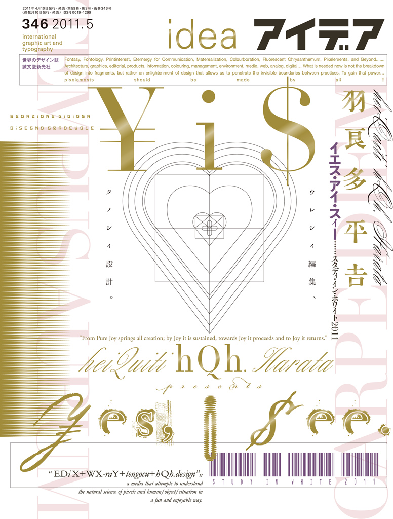
IDEA No.346
Published: 2011/5
Price: 定価3,457/3,143+tax jp yen soldout
Keyword
heiQuiti Harata: Yes, I see.
Ut graphica poesis
Harata HeiQuiti (Heikichi) is a Japanese graphic designer whose focus is in editorial design and whom is well-known for his poetic visuals. Harata was born in 1947, and graduated from Tokyo National University of Fine Arts and Music with a major in Visual Design.
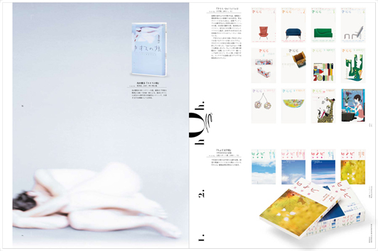
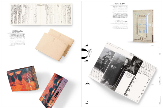
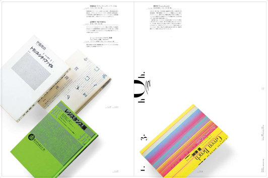
Influenced by preceding 60s designers like Sugiura Kohei and Yokoo Tadanori, Harata began working freelance solo and developed a highly signature optical/pictorial/poetic means of combining of imagery and typography. He is influenced by early 20th modernist writers and poets like Inagaki Taruho. Parataxis – the literary technique of conscientious connection using short sentences about very distant topics by framing them together – lays at the very core of his approach.
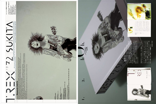
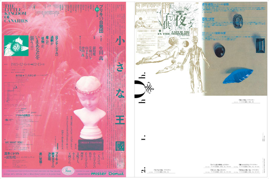
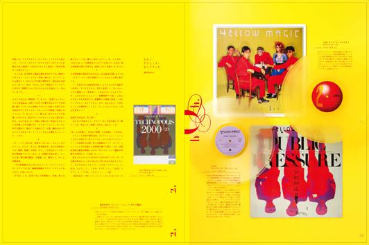
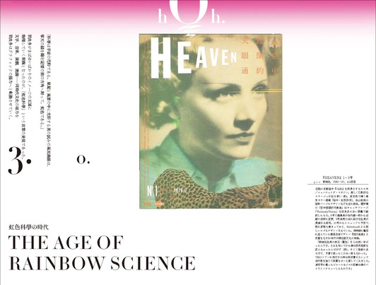
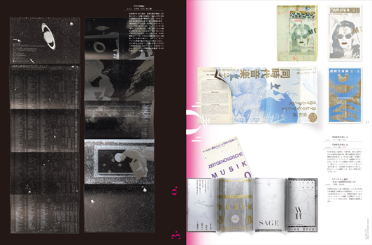
In the early 70s, Harata worked on the magazine ‘Shinjuku Play Map’, which led to a large body of commissions in editorial design, from which he gained a strong following. His early visual works for Japanese underground magazines like Heaven and visuals for the legendary Japanese popular music group Yellow Magic Orchestra embodied the zeitgeist of Japanese New Wave graphic design and visual art in the 80s. In the same period, he self-published an independent magazine “WX-raY” – even though only an inaugural issue was published, Harata’s influence reverberated widely, sparking a wave of self-initiated and self-published media by graphic designers.
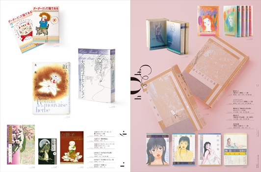
These activities have made Harata a cult star in Japanese graphic culture. He has been active in various cultural fields including literature, music and theater. Harata is one of pioneers of Japanese comic book design, realizing a high integration of letters and characters within the projects he takes on. When the whole of his career is assessed, many regard him as the visual forerunner of contemporary Japanese visual subcultures.
Harata developed and practised his own book design methodology “Shoyo-Sekkei”. Literally translated, the aggregate parts are: Sho (book) + Yo (vessel) + Sekkei (design). No mere conflation, the Yo element simultaneously means “outlook” – referring not only to modern Western “form and content” philosophies , but a more holistically comprehensive overview of the total architecture of the book as object and how readers will interact with a book project as both object and media. Harata utilizes traditional Japanese aesthetics to help reify both the thought and form of these types of projects.
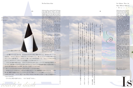
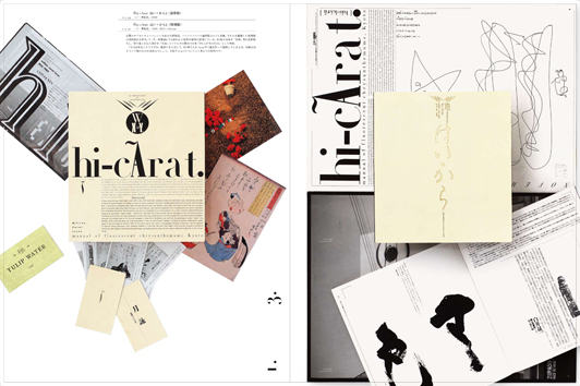
After the introduction of computers in the late 80s, Harata began researching his own aesthetics based on an ontology of the tools at hand – pixels and digital typefaces, which are conceptualized into his coined terms like “pixel zone”, “fontasy” or “fontology”. After years of applied research examining the relationship of digital tools, writing and media, Harata’s interests have shifted toward an examination of the ambiguity and concreteness of shiro, the Japanese word which represents both white and emptiness.
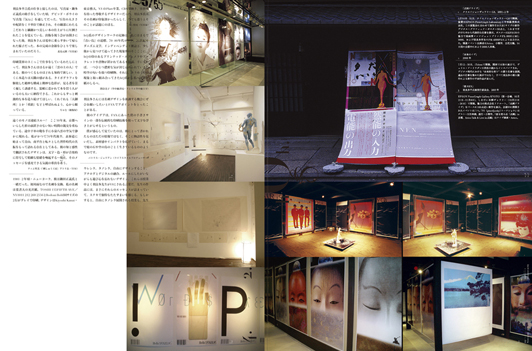
At the core of Harata’s practice is a desire for a unified methodology of total design that dissuades deconstruction or fragmentation. Heavily reliant upon the compound, juxtapositional nature of the Japanese language, Harata’s work is worth prolonged examination. This issue of IDEA introduces Harata’s design works from a career-long perspective. Our hope is that it represents the very best in potentialities of graphic expression with imagination and integration, as opposed to the disintegration of design into mere methods and mannerism.
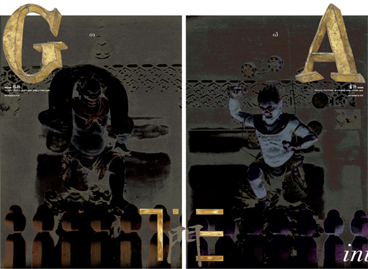
Study in White 2011
Artwork & Design by heiQuiti Harata
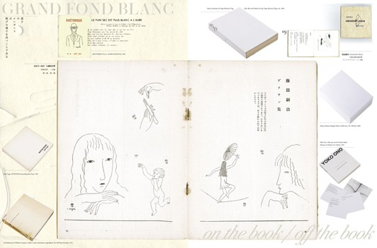
I Editorial Architecture
1 Libri Taruphonum
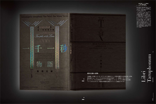
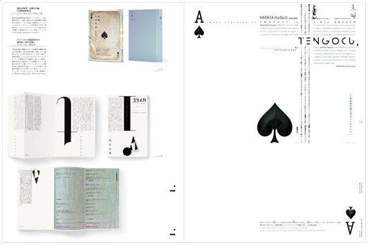
2 Pixelzone & Fontazy
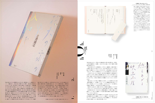
3 Editing for Joy, Designing for Pleasure
4 Manga Maniera
II Graphics on the New Wave
1 Print for Play
2 Sound & Vision
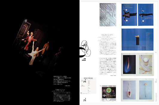
III The Age of Regenbogenwissenschaft
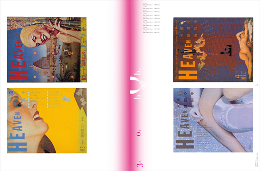
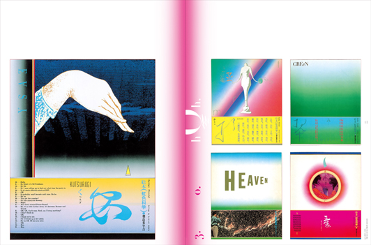
IV Notes
1 Study on hQ
2 Comments on hQ
3 hQ Archive
4 Interview with hQ
