Keyword
Digital copies of IDEA Magazine are now available !!
▶︎click here to purchase
【Special Feature 】
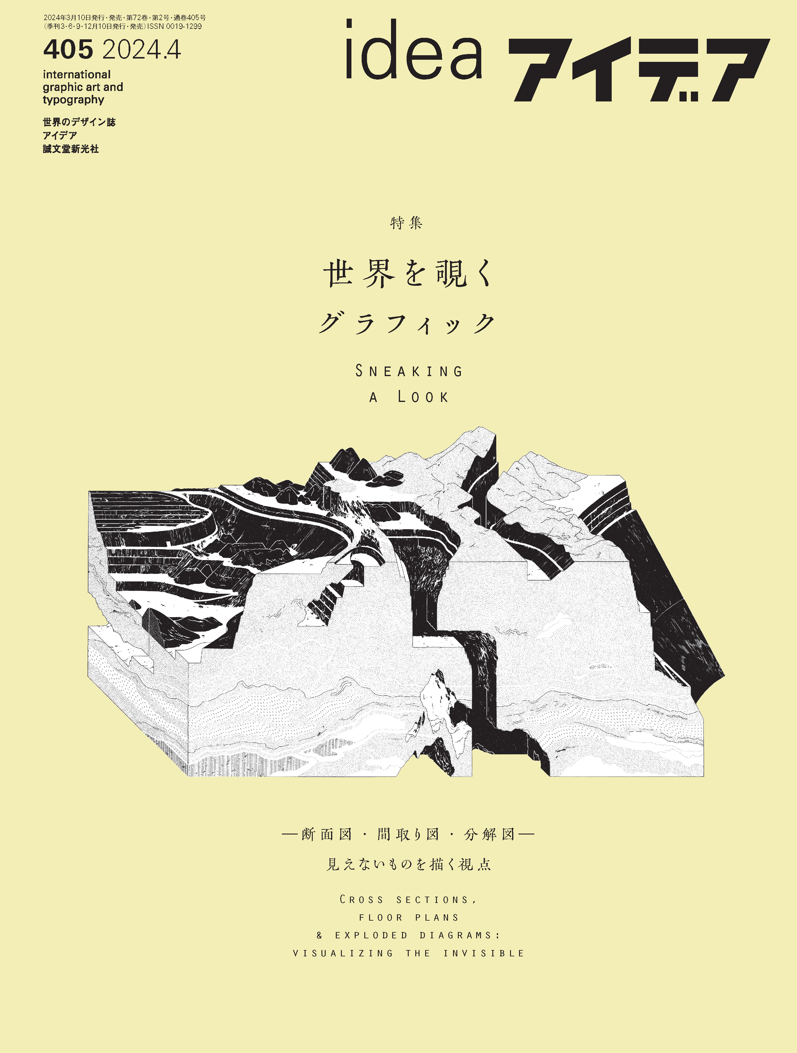
Sneaking a Look
Cross Sections, Floor Plans & Exploded Diagrams: Visualizing the Invisible
Direction by Idea
Design by LABORATORIES (Kensaku Kato, Sae Kamata)
Visual representations depicting the inside of cities and structures that human eyes cannot normally see have a mysterious allure that captures the imagination of the viewer, including structural drawings and floor plans depicting the framework of buildings, cross- sectional views of subways and sewers crawling underground in huge cities, and bird’s-eye views of production lines inside closed factories. The illustrations in thepicture books, which depict exploded views of vehicles and machines, human anatomy, and the contents of vegetables and plants, attract many children. Bird’s eye views of the city and house floor plans also serve as visual devices that engage adults’ memories and imaginations.
Seeing or drawing invisible objects is one of the fundamental human desires. When and how did illustrations, such as cross sections and bird’s eye views, come into existence? Its origins can be traced, for example, to the cave paintings left by Aborigines in prehistoric Australia (known as “x-rays,” paintings of animals and fish with transparent bones and organs). As time progressed, many cross- sectional representations were used in medicine and engineering to explain the inner workings. Some of them, such as Leonardo da Vinci’s anatomical drawings of the human anatomy, went beyond their original use and reached the realm of art. Furthermore, from the latter half of the 19th century to the 20th century, with the spread of printing technology, people in Europe and the United States became familiar with cutaway or cross-section illustrations for newspapers and magazines. During the Great War in the 20th century, many cutaway illustrations of modern fighter jets, tanks, and battleships were drawn in Japanese children’s science magazines and comics.
In Japanese visual culture, which has a long history of grasping space with a perspective that differs from the realistic pictorial representation of the West, such as suiboku-ga (ink painting) and ukiyo-e (Japanese woodblock prints), illustration seems to be familiar as a method of expressing lyricism and ambiguity rather than a functional one. We might say it is an intermediate expression, neither written nor painted. This may be due in part to the influence of the“Heta-uma” illustrations (designating a work poorly drawn, but with an aesthetically conscious quality)by artists such as Teruhiko Yumura and Kotobuki Shiriagari, which became popular in the field of commercial illustration in the 1980s.
On the other hand, “infographics” and “data visualization” in the field of graphic design play a functional role in explaining things through diagrams, a role that illustration has not played in Japanese visual culture. But we have a concern that the rise of computer graphics and the tendency of people to place an excessive priority on “comprehensibility” in recent years have led to the uniformity of expressions. What kind of expression is it that sublimates the rich expression that illustration has fostered and connects both illustration and design?
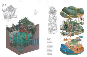
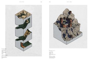
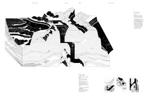
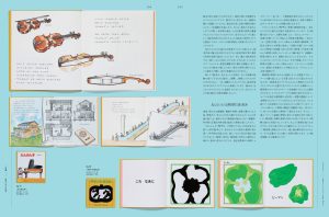
In this special issue, we explore the “visual representation,” that is graphics, regardless of field. The eight artists of all times and places we feature in this special issue are from different backgrounds, some as illustrators and others as architects and game-graphers. They all focus on depicting the “inside of things” and continue to produce eye- catching works using expressions such as cross-sectional drawings and floor plans. We will also introduce the work of authors who are fascinated by drawing the invisible, such as spatial expressions in picture books and illustrations in the areas of maps and architecture in our contributions and small features in the latter half of the special issue. We hope that many readers will encounter new discoveries and excitement through their perspective.
Honami Enya
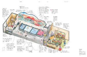
Kei Endo
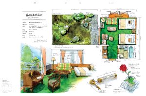
Tetsuya Masaki
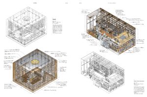
Seiji Yoshida
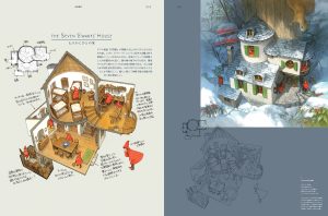
[Interview]
Seiji Yoshida Believability techniques: Seiji Yoshida’s bird’s-eye view of the world
Text by So Takahashi
[Special]
Kappa Sneaky Peeks: Kappa Senoo’s illustrations and their perspectives
gozz
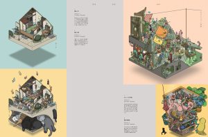
Doug John Miller
Owen D. Pomery
Éva Le Roi
[Special]
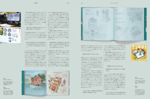
Visualizing the invisible in picture books
Text by Misa Sasaki
[Essay]
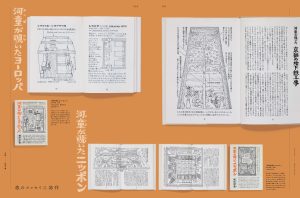
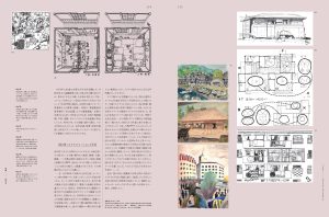
Nishiyama Uzo and Illustration
Text by Shigeru Matsumoto
[Essay]
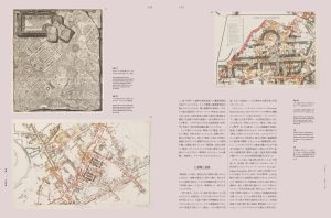
The desire for introspection – a literary fragment on fault lines
Text by Akio Ota
[Essay]
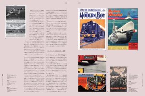
Leslie Ashwell Wood:
Britain’s Finest Cutaway Artist
Text by Steve Holland
Design Eccentric
From the World Collectors’ Room
vol. 5 The Design Reviewed Archive, part 5 Designing History: The Legacy of Jan Bons
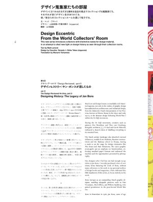 Text by Matt Lamont
Design by Kazuhiro Yamada + Akiko Takeo (nipponia)
Translation by Manami Yamamoto
Isao Mitobe and Naoko Nakui Landscapes seen through book design
 Text by Toshinobu Nagata
Photography by Satoshi Aoyagi
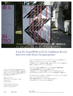
Form #1: FormSWISS at ECAL Exhibition Review
Interview with Alexis Georgacopoulos
 Translation by Manami Yamamoto
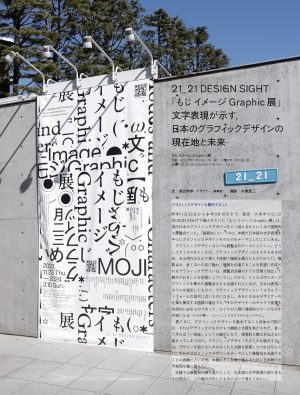
21_21 DESIGN SIGHT
“Modes and Characters: Poetics of Graphic Design”
The now and future of Japanese graphic design, seen through typography
 Text by Toshinobu Nagata
Photography by Keizo Kioku
Information
Book


